Overview
CHALLENGE
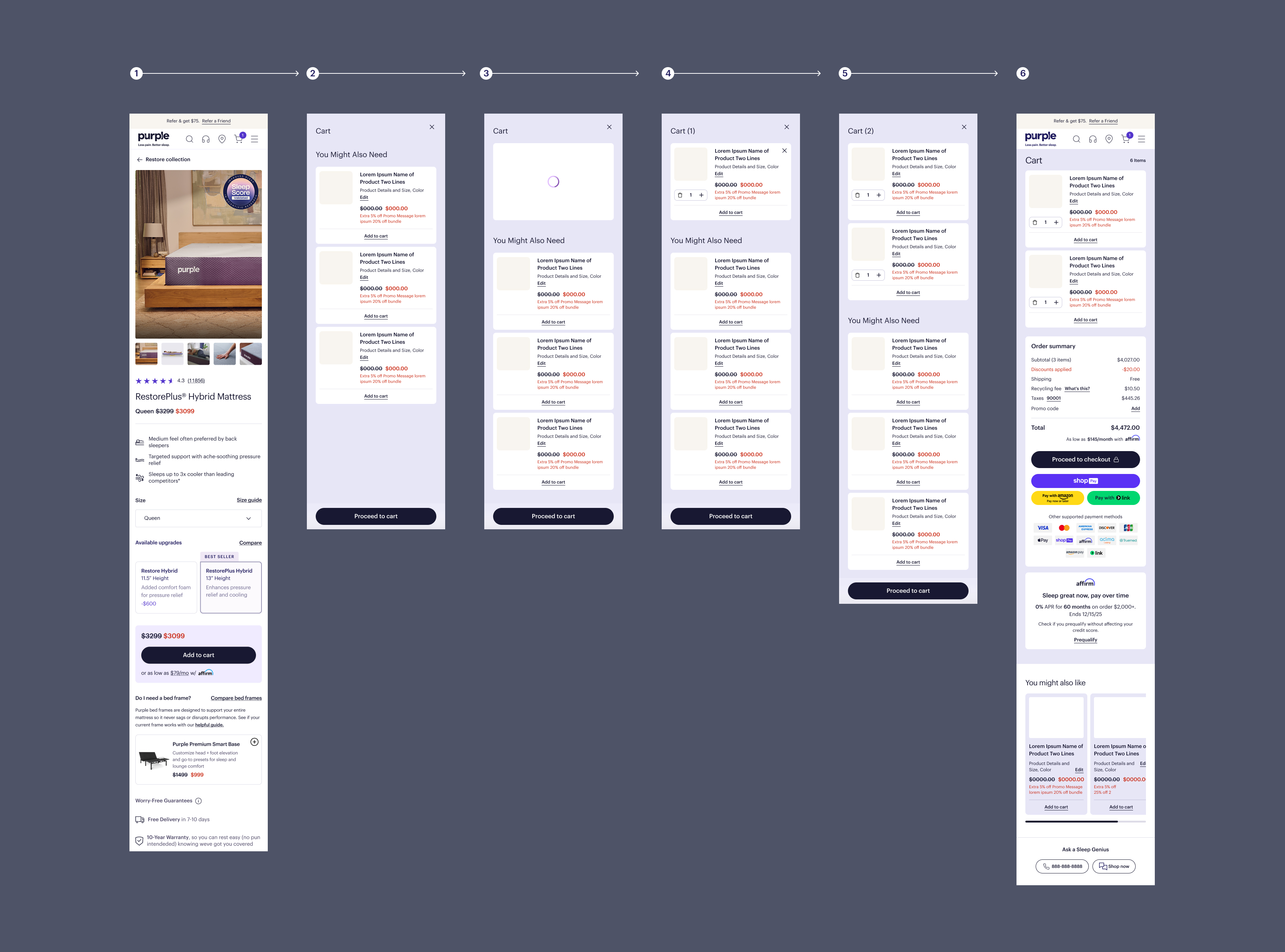
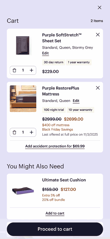
Purple’s cart overlay represented a high-intent moment, but historically functioned as a confirmation state, not a shopping surface.
Users often realized they needed accessories (pillows, sheets, protectors) after adding a core product, forcing them to navigate away from checkout momentum.
How might we introduce an additional shoppable opportunity without disrupting momentum or increasing cognitive load, especially on mobile?
goals
01
Increase accessory attachment at a high-intent moment.
02
Reduce friction by enabling users to add/editing items without leaving the cart overlay.
03
Maintain clarity, hierarchy, and trust in a sensitive conversion step. Must not distract from the primary goal: proceeding to checkout.
Phase 1: Initial Quick Add Concept (2024)
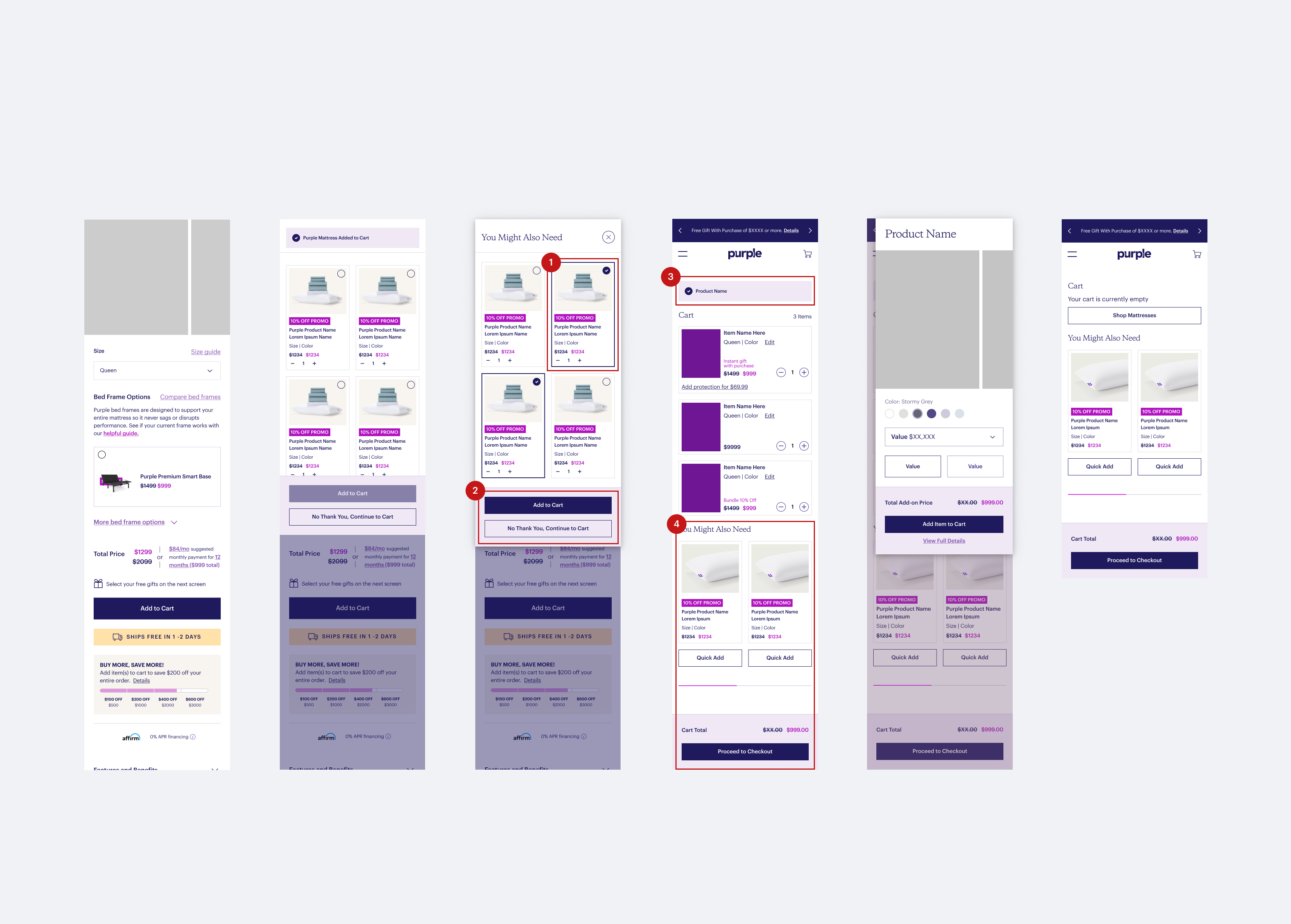
What Worked
01
Established the cart overlay as a shoppable surface, not just a confirmation state through high customer engagement.
02
Proved feasibility and internal alignment around the concept.
03
Opportunity to improve clarity, scannability, and full functionality.
What Didn't Work
01
Products and logic were tightly coupled to development work. Site merchandisers were unable to easily swap products. This made iteration slow and restricted responsiveness to business needs
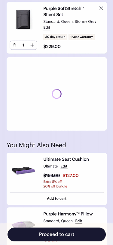
02
Users were required to select items first and then tap a separate “Add to Cart” CTA, creating unnecessary friction. Perceived cognitive overload with CTA structure.
03
Successful add-to-cart feedback relied on a toast notification. On mobile, this message was easy to miss and visually disconnected from the Quick Add interaction
04
The “Proceed to Checkout” CTA was pushed further down the page. Increased scrolling at a critical decision moment. The feature unintentionally competed with the primary conversion goal.
Phase 2: Iteration & Updated Experience (2025)
Simple User flow
One-step, low-effort interactions
Improve clarity and feedback
Hierarchy that protects checkout momentum
Scalable merchandising control
Overview
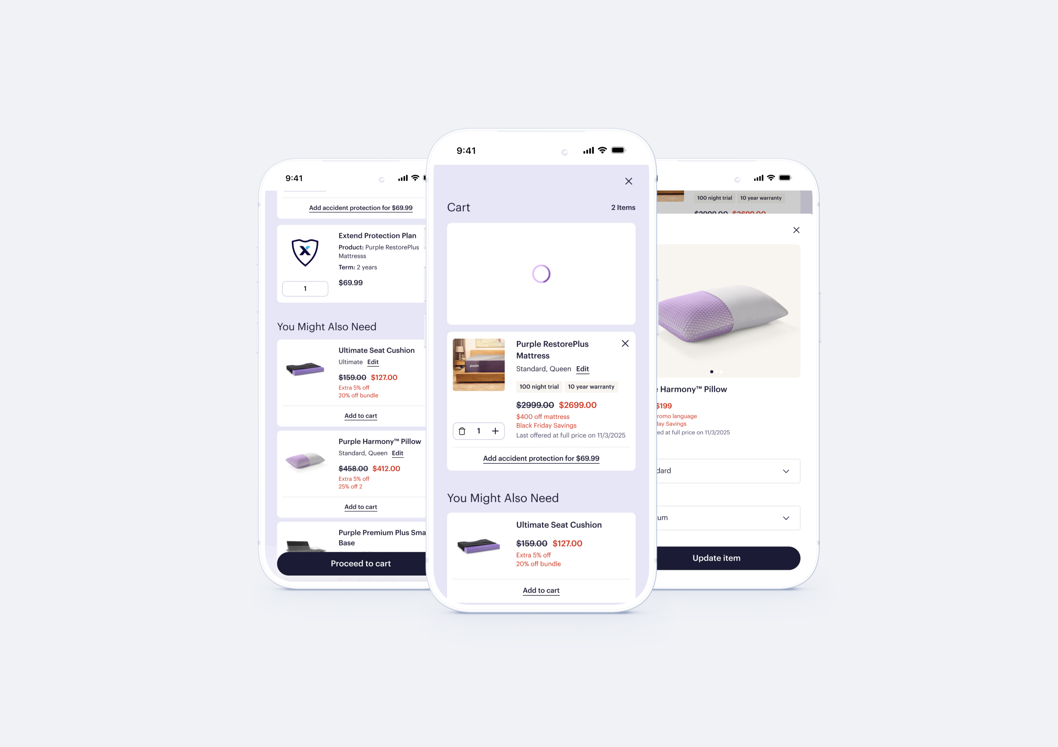
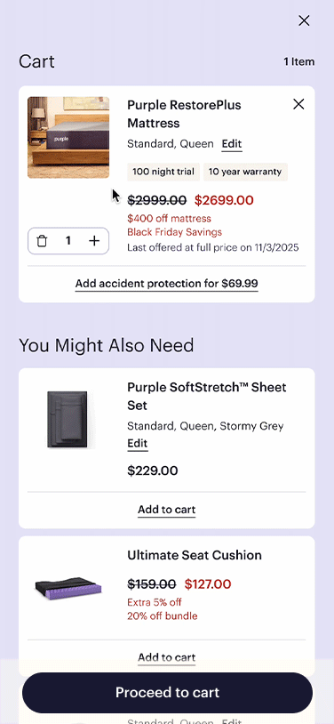
With the updated experience, the goal was to remove friction, clarify intent, and make Quick Adds feel like a natural extension of the cart, not a detour from it.
Insights
01
Introducing a single-tap interaction with immediate, in-component state change confirms success. Removed unnecessary decision points for faster interactions and increased confidence at the moment of action. This reduced hesitation before checkout.
02
Feedback must live at the point of interaction. Embedded feedback directly within the Quick Add component created clear visual state change after item is added resulting in clear confirmation without interruption of shopping experience.
03
Secondary features should never compete with checkout. Preserving prominence of the primary checkout. Checkout momentum is protected becasue Quick Add does not disrupt conversion.
04
Improved Quick Add product logic enabling merchandisers to swap products, adjust ordering, iterate on accessory groupings independently. This resulted in faster iteration cycles, more adaptable system use, and long-term product sustainability.
Key Features
Effortless Interactions
At critical conversion moments, interactions are designed to be as close to one-tap as possible. This reduces cognitive load and keeps users focused on completing their purchase.
Designed for Changing Your Mind
Adding, removing, or editing items is streamlined to minimize steps and reduce hesitation. The experience supports exploration while maintaining momentum toward checkout.
Clear Feedback
Every action provides immediate, in-context feedback so users know their selection was successful. By embedding confirmation directly within the interaction, the experience builds confidence without relying on secondary system messages.

PRODUCT IMPACT
Cart evolved from confirmation state → conversion-supporting Experience
For a more in depth walkthrough please reach out — email me!