Overview
CHALLENGE
We set out to reduce mattress confusion and cognitive overload on Purple’s product page
Purple’s mattress product pages contained a lot of information, pricing variables, and feature differentiation that often led to customer confusion and hesitation.
This project focused on redesigning the PDP experience to clarify product differences, improve information hierarchy, and introduce clearer product education ultimately helping customers feel confident in their decision while maintaining conversion momentum.
Before designing solutions, we synthesized insights from customer feedback, behavioral data, and competitive analysis to understand where confusion was happening and why.
goals
01
Reduce confusion between mattress models and help differentiate prodcut offering in an effort to ease decision making. Customers stated they felt overwhelmed by assortment and could not decide which mattress was best for their needs.
02
Create a clearer price and value narrative. Emsure that customers are able to easily understnad price, promo and the value of the product.
03
Maintain or improve conversion performance by educating customers on the best mattress to address their sleep problems resulting in confident purchase.
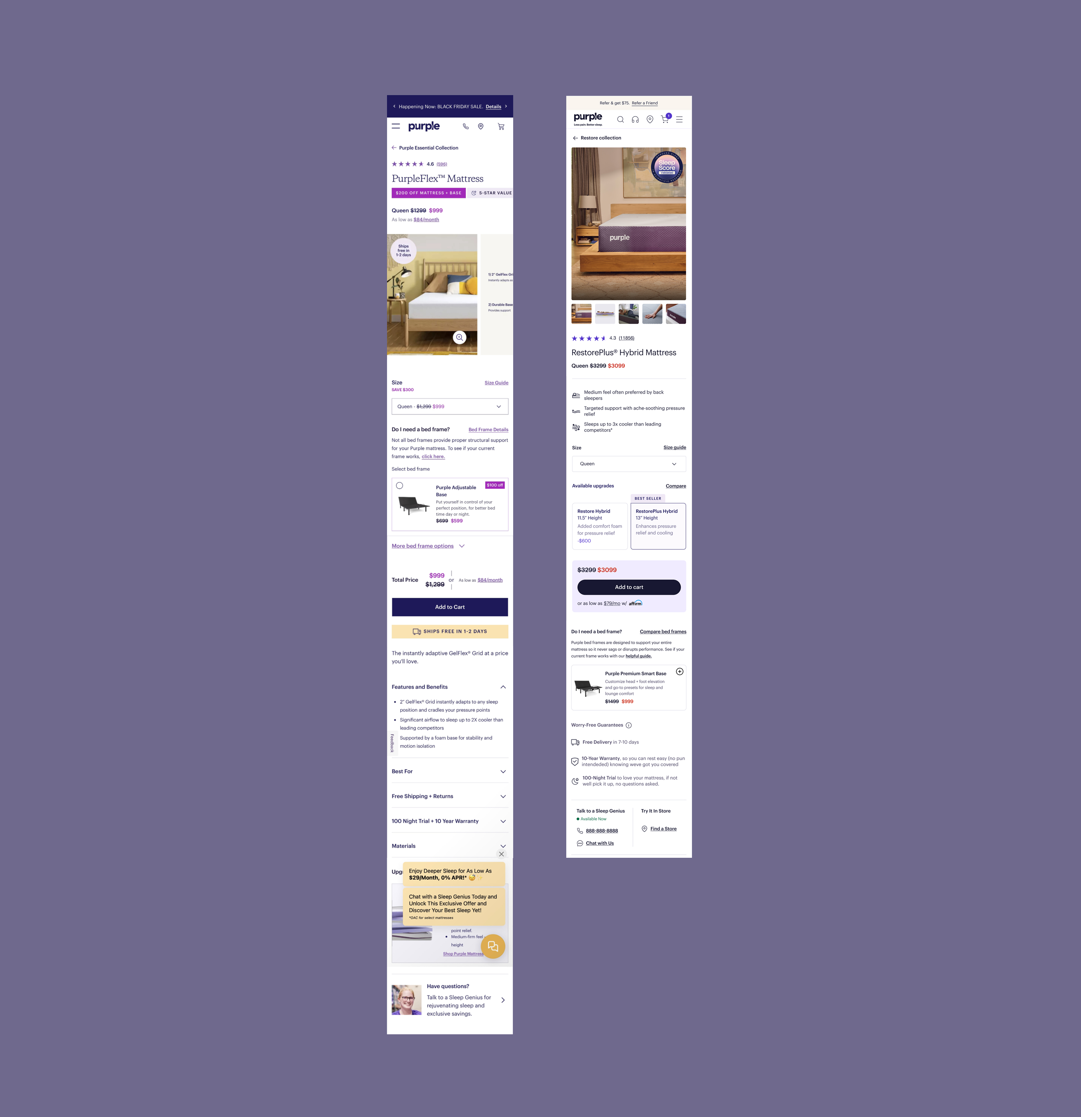
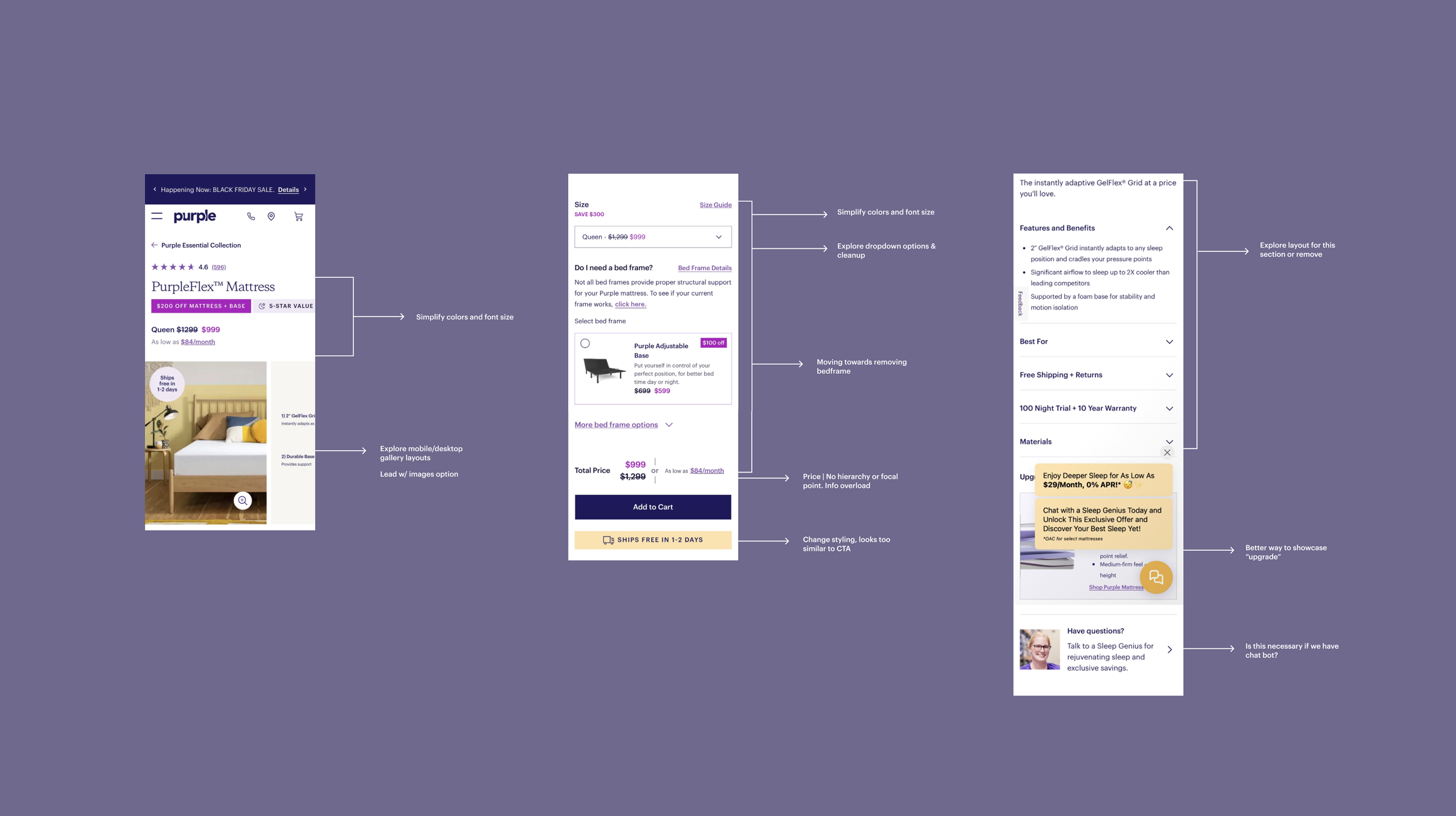
Original Product Page Experience Annotations
Design Strategy
Core Principles
Product education before persuasion
Progressive disclosure over information dumping
Clear hierarchy at high-intent moments
System-first, reusable solutions

Design Exploration & Iteration
With these principles in mind, we defined a set of updates to anchor the redesign and keep the experience focused and scalable.
Updates
01
Introduce new educational modules to help customers quickly understand what makes each mattress different without requiring deep technical knowledge.
02
Restructure the PDP to align with the customer’s decision-making flow, surfacing the most important information earlier and deferring secondary details.
03
Refine existing PDP components to better communicate hierarchy and intent. These components would be updated in our design system for scalable use.
User Testing
Positive feedback
01
Users stated that they found the bullet features informative and helpful in making a decison on whihc mattress to further explore. It narrowed the scope of their search. Participants could recall 1–2 product benefits even without reading deeper content.
02
Users found the gallery placement and imagery to be very helpful. They enjoyed the graphics and easy to digest information provided. Validated design decison to prioritize gallery placement.
03
All users understood the final price faster and focused more on product education. Simplified price modules reduce hesitation and improve comprehension.
Areas of improvement
01
Compare is an important feature to users at various points of purchase allowing for clear differentiation. Leverage their desire to compare and ensure that is a top feature throughout the flow, addition of larger compare section below fold.
Key Features
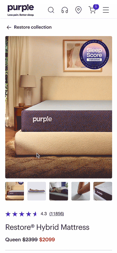
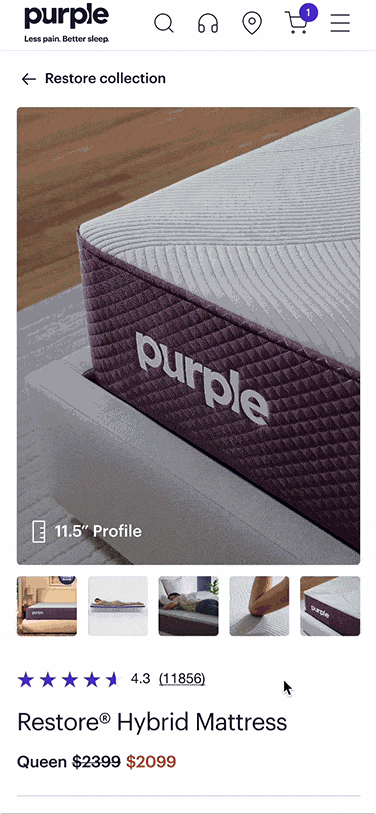
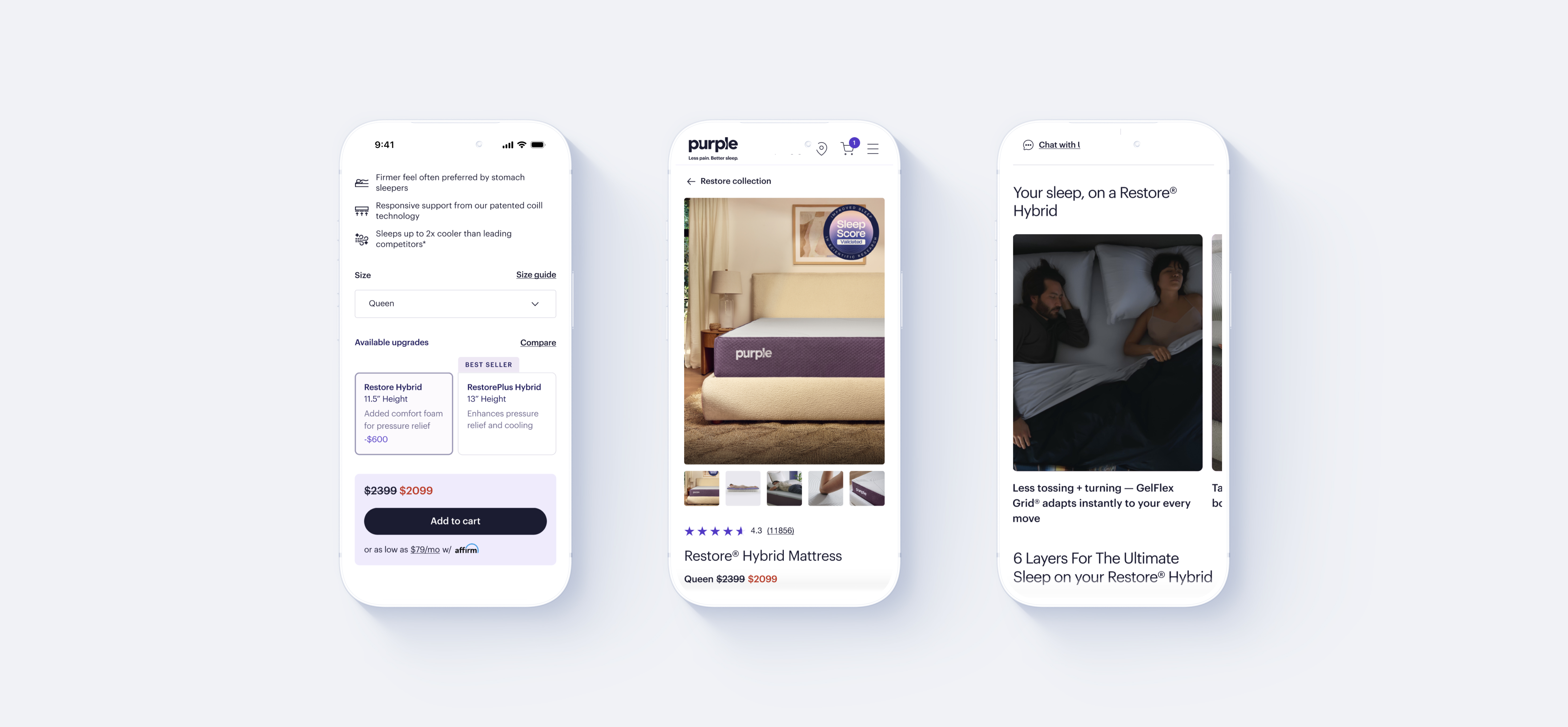
Gallery Product Storytelling
Redesigned the gallery to better match mobile screen ratios and introduced carousel affordances to help users anticipate available content. This pushed educational content to the top of the flow, increased interaction with media and set context for education before pricing decisions.
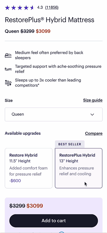
Scannable Product Features & Guarantee Highlights
Added concise, scannable bullet points shortly after the gallery that highlighted key decision making features as well as lower down the flow. This increased user confidence early in the experience and allowed users to self-qualify before engaging with detailed specs.
Refining Price & Promotion Hierarchy
Pricing and promotional messaging were previously competing for attention, distracting users from understanding product value. We reduced redundant price repetition creating a clearer perception of value.
Dynamic Mattress Compare
Introduced a dynamic comparison feature that allows users to switch between two mattresses while maintaining their position on the PDP. No need to open a new page or tab, deal for mobile users.