OVERVIEW
CHALLENGE
As a team we asked: How can we educate customers on why, when/where and how this new product line could positively impact their intimate care and ultimately create loyal customers?
goals
01
Create an Educational and Empowering Platform
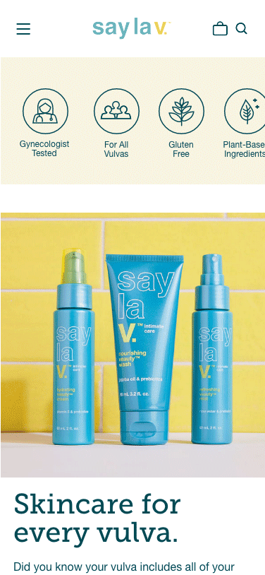
The primary goal was to position Say La V as the authoritative source for information and expertise related to intimate wellness. This involved creating a platform that not only sold products but also provided valuable educational content, backed by gynecologist and doctors, reinforcing the brand's commitment to empowering women through knowledge.
02
Develop an Intuitive User Experience with Strong Visual Identity
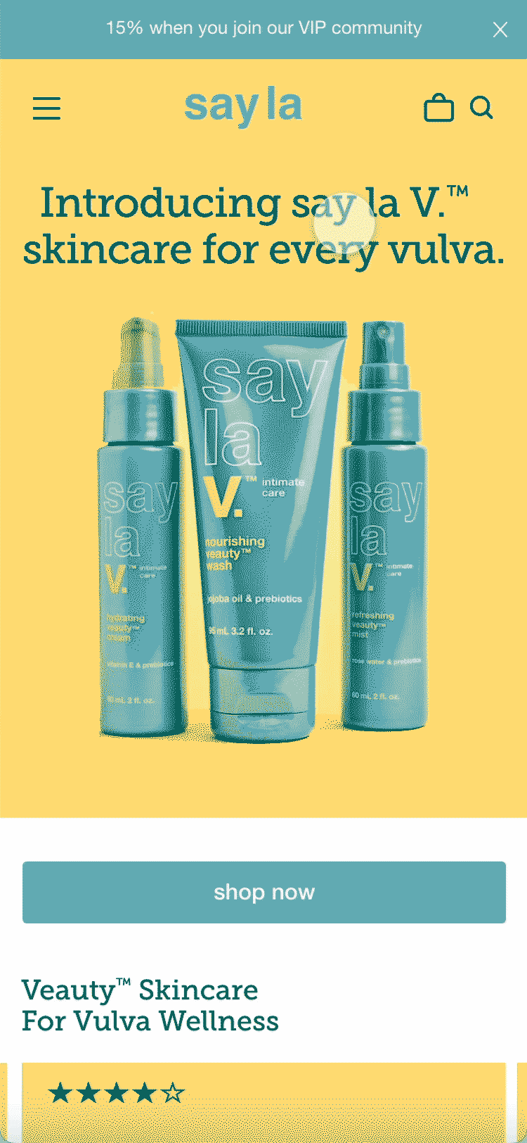
Ensuring an intuitive and visually appealing e-commerce platform was crucial. This goal encompassed providing a seamless shopping experience, from product exploration to checkout, and presenting the brand in a visually engaging manner. The design needed to reflect the brand's personality and resonate with our target audience.
03
Establish Clear Information Hierarchy and Consistent Design System
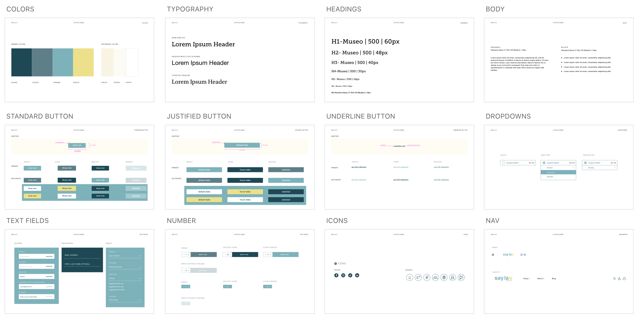
Create a UI Design Style Guide, complete with various components, clear guidelines and templates empowering future teams to effortlessly maintain consistency across website updates, email campaigns, and social media posts.
RESEARCH
COMPETITOR ANLYSIS & SWOT Analysis
-3.jpg)
-2.jpg)
Insights
01
Visual Consistency and Branding
Define a consistent visual language and branding that aligns with the brand identity. Use colors, imagery, and typography to convey a cohesive and appealing design across the site.
02
Streamlined Navigation
Prioritize a streamlined and intuitive navigation system. Ensure that users can easily find information, products, and services. Conduct usability testing to identify and address navigation challenges.
03
Mobile Responsiveness
With an increasing number of users accessing websites via mobile devices, mobile responsiveness is crucial. Design the site to be fully responsive on various devices. Test the user experience on mobile to ensure seamless navigation and readability.
04
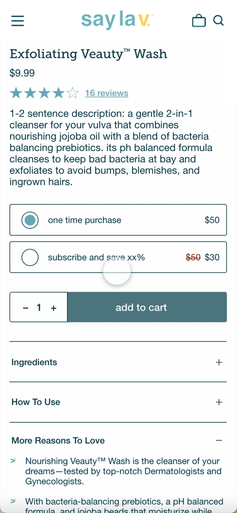
Subscription Optimization
Optimize the subscription experience by ensuring a clear and enticing value proposition, a streamlined and intuitive subscription flow, and transparent pricing. Implement personalized options and mobile optimization to create loyalty online.
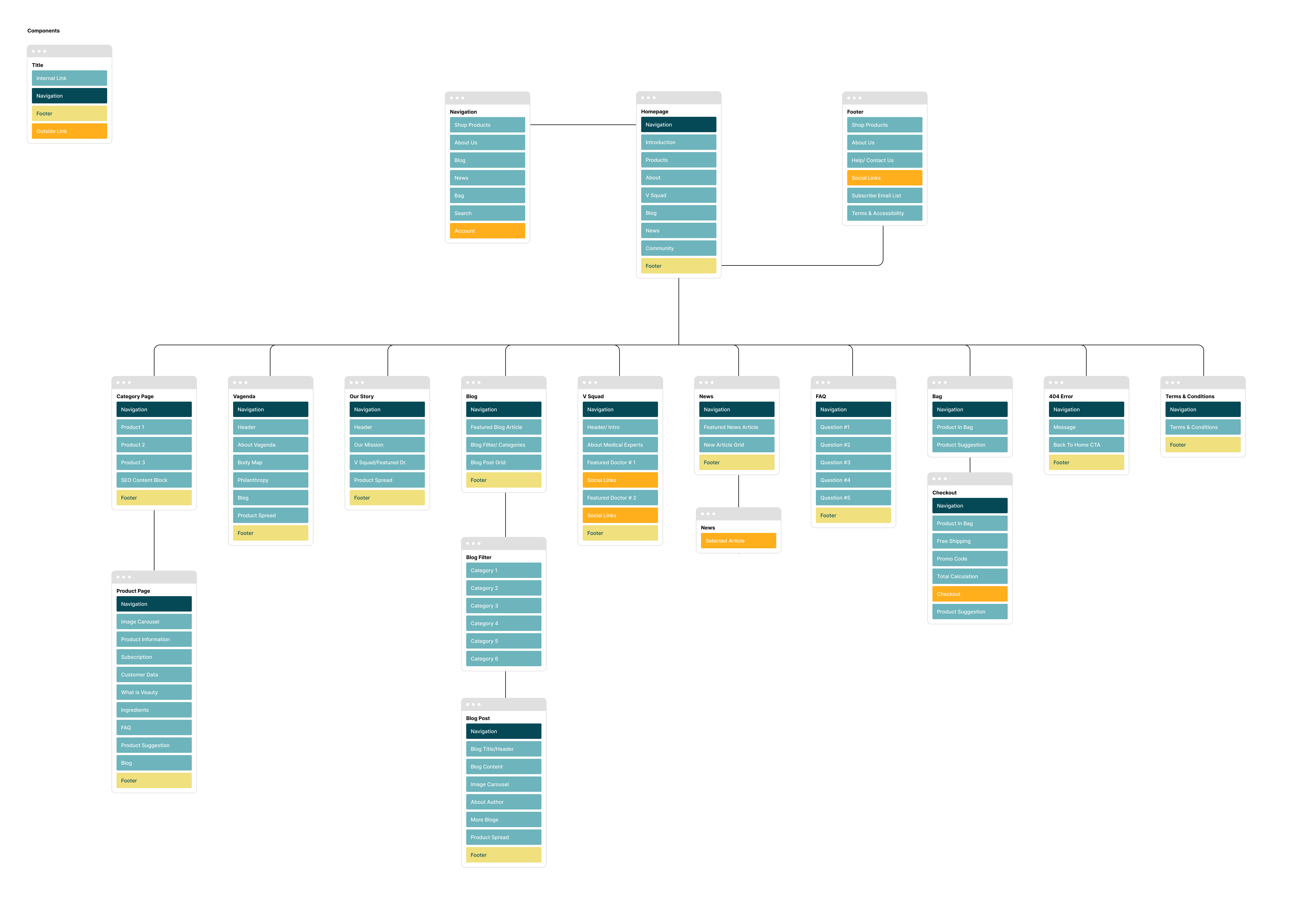
SITE MAP
Content Brick
IDEATION
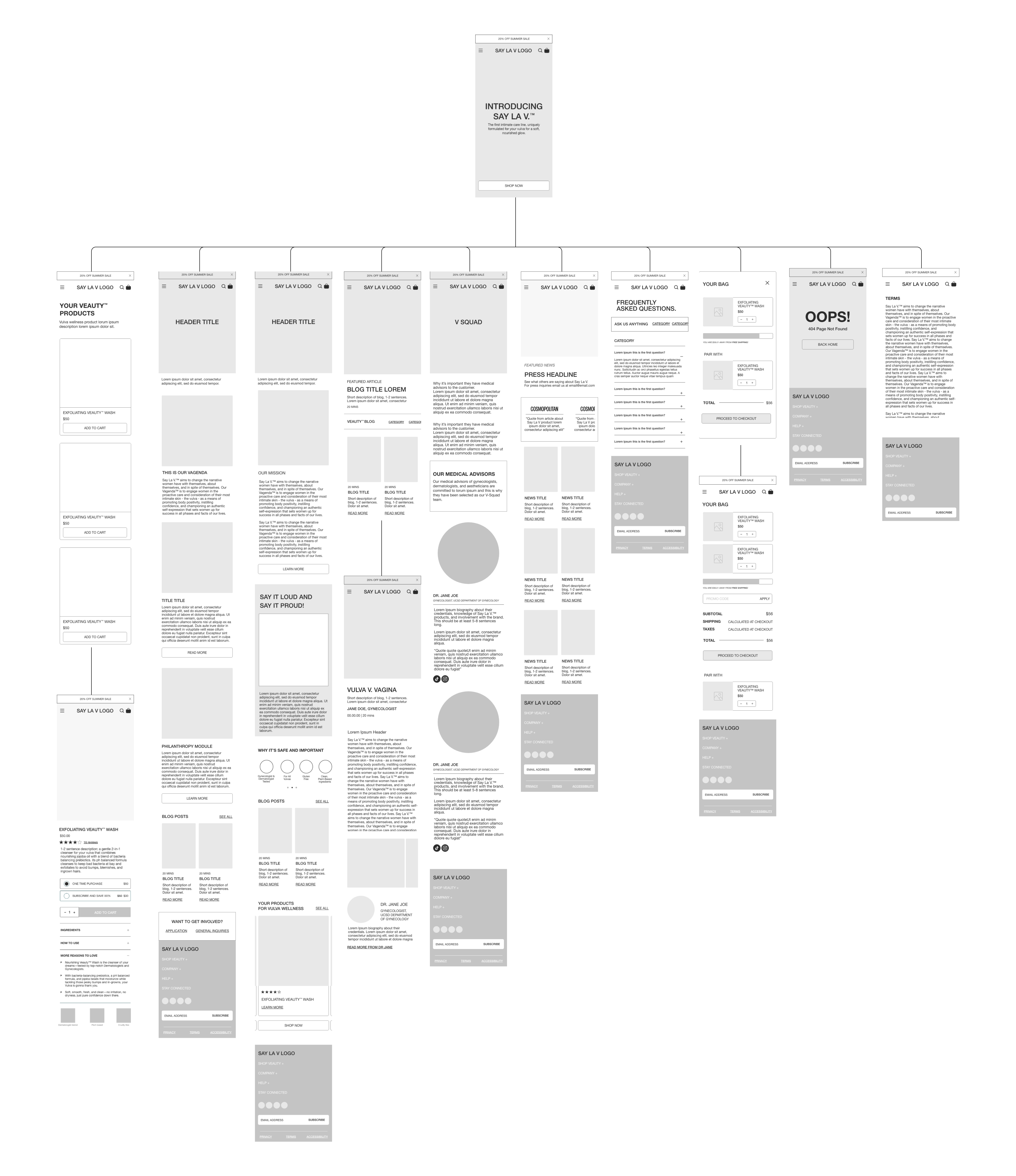
Medium Fidelity WIREFRAMES & Prototype
FEEDBACK
2 Rounds of review with Client
The client received the provided sitemap, along with mobile and desktop wireframes containing a basic prototype functionality. This enabled the team to thoroughly examine the user flow, review suggested content, and offer constructive feedback to both the project manager and me.
Our objective was to solicit feedback on the holistic customer journey, pinpoint any potential pain points, and iterate for within two rounds of feedback before starting the design phase.
OVERVIEW
01
Functionality
Ensuring that the functionality of the design aligns with user expectations. Users should be able to interact with the interface in an intuitive and predictable manner. The wireframes included basic prototypes to represent how different elements will function.
02
Content Placement
The wireframes provided an opportunity to establish a logical flow of content within the interface, a key element to our goal of educating the customer. Feedback during this round surrounded the balance between educational modules vs product modules.
03
User Flow & Navigation
In pursuit of an intuitive navigation structure, we collaborated with the client in a working session to finalize content links for the navigation bar. This allowed us to refine the overall customer journey and address potential pain points. The outcome resulted in a navigation structure aligned with user needs and business objectives.

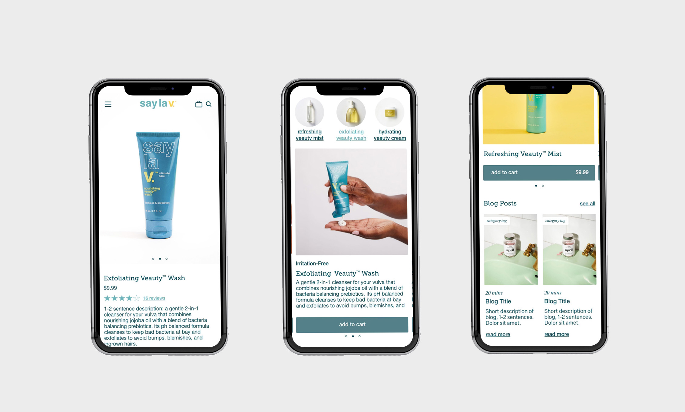
HIGH FIDELITY PROTOTPYE
HOW DID WE GET HERE?
Through a collaborative process, we successfully crafted a final high-fidelity prototype by synthesizing my insights, incorporating iterative feedback from the client, and conducting resourceful usability testing. This dynamic approach ensured that the prototype not only reflected a user-centric design but also resonated with the client's vision, resulting in an impactful and polished user experience.